From revolution to evolution
Remote work wasn’t a new idea in 2020, but COVID changed everything — the scale, the stress, and the stakes of showing up on camera. Into that topsy-turvy world strode mmhmm, a video tool with a deliberately provocative name and a playful personality to match. It was fun, and useful too.
But by 2025, the world had changed again. The quirky name that once sparked curiosity was now a liability. It was hard to spell, hard to say, and hard to take seriously. The product had grown up and was ready for anything, from sales calls to executive presentations. But nobody knew it.
It was time for the brand to catch up with the product, and find its way in a world where novelty was not enough. And we had six weeks to make it happen.
My role
As Director of Brand Content at All Turtles, the studio that first created mmhmm, I led a critical side of the rebrand from concept through launch. That meant renaming the company and its products, setting a messaging strategy, shaping voice and tone, and writing virtually all of the copy that went out the door — web pages, onboarding emails, blog posts, social media, and video scripts.

The why shapes the word
The name had to do a lot of work. It also had to be crystal clear, and it had to be adaptable as the product evolved from a single, complex app to a nimble toolkit for working over video. So I went back to the “why.” Who was it for? Why did they need it?
Mmhmm was about making meetings livelier, but the new brand was focused on bigger things. Being a better communicator. Making the right first impression. Becoming more persuasive and memorable every time the camera is on.
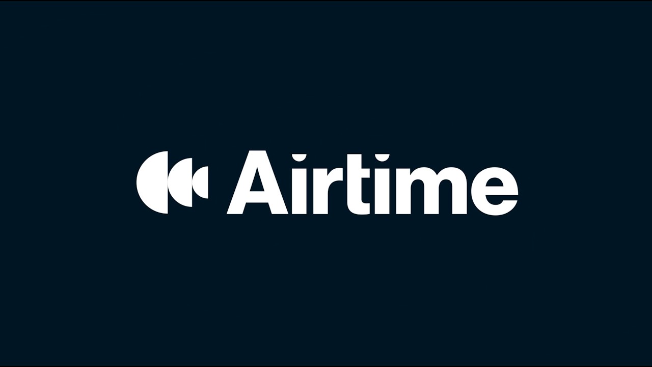
We looked at hundreds of names, but Airtime surfaced in the first brainstorm and never left the table. It’s simple, friendly, and above all meaningful. In broadcasting, airtime is your share of attention. For a product built around how you show up and communicate on video, it was exactly right.
Once we had the name, I built messaging frameworks for the brand and each individual tool, connecting each value pillar directly to a specific product feature, so the copy was never decorative. Every word had a purpose.

Copy and design, in lockstep
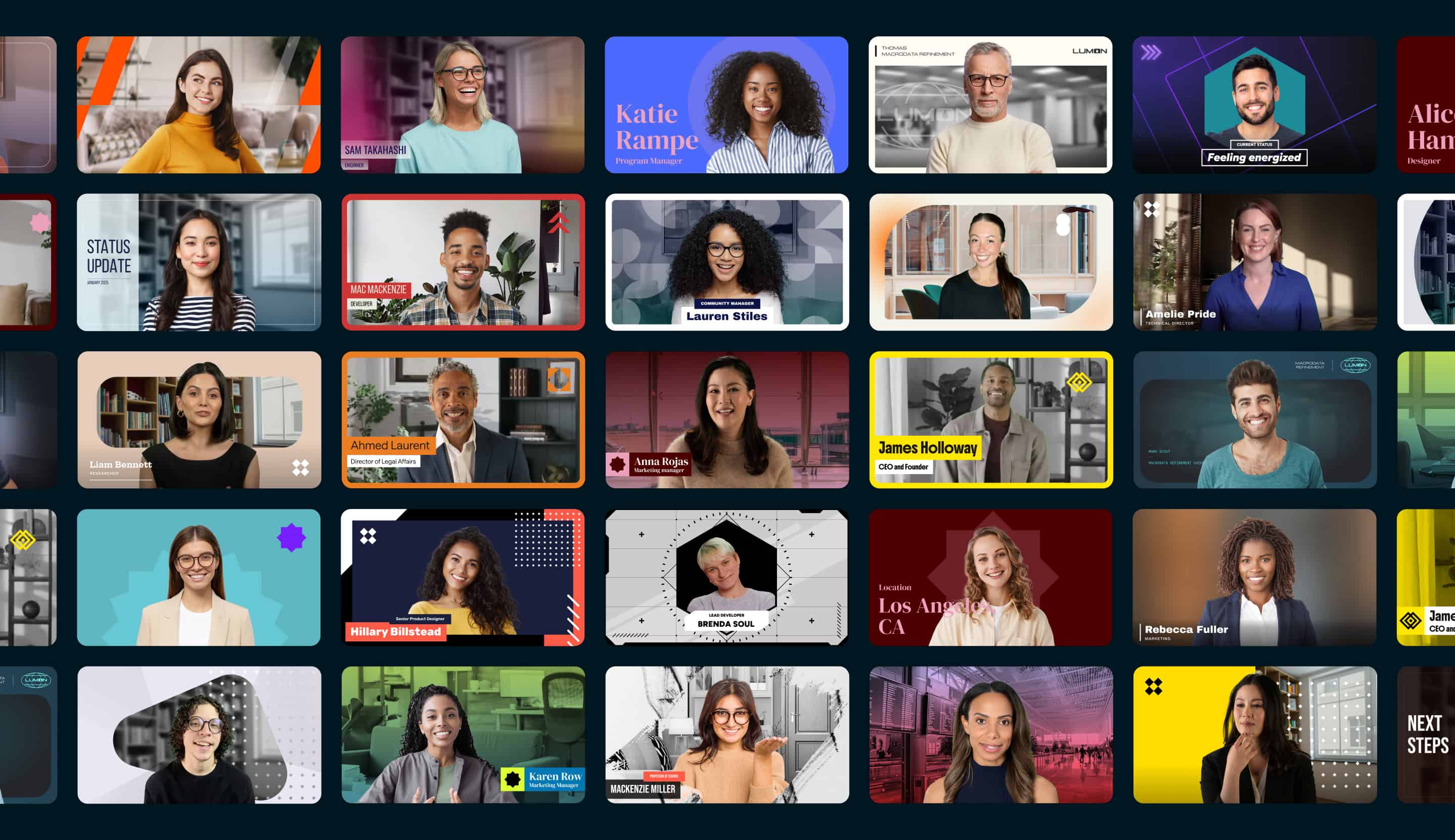
Like the product, the process was all about smarter collaboration. I’d draft copy while a designer was building a wireframe. They’d look at my draft and adjust their layout, and I’d ensure the copy still worked with their changes. We’d sync up and refine again. All while staying in close contact with product design to ensure everyone kept moving in the same direction. The result was copy, visuals, and UX that worked in tandem instead of pulling against each other.
And it worked. A rebrand that might have taken six months at most other companies was complete in less than two, but it wasn’t slapdash or a rush job. It was thoughtful, clean, and connected from top to bottom.
Airtime launched in early 2025 to a strong reception from existing customers, sparking renewed growth. And my work was featured in Eddie Shleyner’s VeryGoodCopy newsletter as a case study in meaningful brand evolution.
I’m proud of the work, but it’s not the quick turnaround that makes me smile, or even the business results. It’s the mission we served, and the way we brought it to life. Because who doesn’t want to be a better communicator?
Project Team
Executive Direction — Christine Foote, Gabe Campodonico
Brand Design — Allie Packard, Namika Hamasaki, Christina King
Brand Messaging & Copywriting — Forrest Bryant
Motion Design — Peter Kemme
More Projects
See the full project list here


